A well-designed blog is your best salesperson.
A blog works 24/7 to generate traffic, inform your potential customers, build brand awareness and capture leads when they’re ready to convert.
Conversely, a poorly designed blog can lead to a bad first impression, user frustration, and lost revenue.
Think of your blog as your Head of Business Development with the following traits:
- Suitable appearance = Well designed blog
- Prompt and respectful of your time = Fast load time
- Articulate and easy to understand = Easy readability and navigation
- Trustworthy = Social signals and trusted sources
I could run with this analogy for days, but you get the point. Your blog is your best salesperson and should be designed for success with that in mind.
So what characteristics define a well-designed blog? A lot more than you’d think…
In this article, we’ll get into why your blog’s design is important, the elements of a blog that you should focus on, and some of our favorite examples of kick-ass blog designs.
Why a well-designed blog matters
Because if your users love it, so will the Google machine.
We’ve all been there. That moment when you’re trying to read an article on your phone. Ten seconds after staring at a white screen and a loading bar, you bail on the page and click the back button to go back to Google search results.
In that same action, the user just told Google “hey, this result kinda sucks.”
The truth is, Google knows a lot more than you think. Whether your page doesn’t load quickly enough or isn’t responsive, Google has millions of other options to present if users are having a hard time visiting your page.
Loading time is just one of the many metrics that you should keep an eye out for when aiming to design a frictionless experience for your web visitors. If you want to learn more about what metrics you should keep an eye on, keep reading.
Just want the metrics? Click here to jump to them.
You’ll build authority and trust with your audience
Us marketers use this term called “top-of-mind awareness.” As you could probably guess, it’s a fancy way of aiming to be the first company that comes to mind regarding a particular service/product.
Try it on yourself.
A car company? A computer company? Or even a water bottle.

Chances are you have a company that immediately comes to mind.
So without millions of dollars for a tagline or logo design, how can you build this top-of-mind awareness within your own industry?
The answer is easier than you think. Build trust and authority by providing the answer to the markets most common questions and concerns.
Where do you provide these answers? Given that 81% of purchases begin with an online search, writing blog content around your customers’ top questions is a great place to start.
Conduct your own content research or consider hiring content marketing experts to help identify the most valuable topics to write about. Then focus on writing long-form, actionable, user-centric content on your blog. Doing this will help you to build trust, authority, and ultimately top-of-mind awareness with your target audience.
Blogging Makes Businesses More Money
We understand that not every reader will be ready to pull out their credit card and buy from you right away. Regardless, a blog is a great way to initiate the sale of your product or service.
Incorporating calls-to-action (CTAs) such as email subscription prompts or contact forms will increase the likelihood of conversions on your blog.
Take a step back to think about where your blog plays a role in the buyer’s journey of your target audience. Chances are, there’s an opportunity to capitalize on opportunities to better convert visitors on your blog.
Elements of a well-designed blog
Design trends, aside. What elements define a great blog design? Now that you’re aware of the benefits of good design, let’s get into the specific elements within your blog that contribute to kick-ass user experience.
Readability
We’ve designed a lot of websites and written a hell of a lot of blogs for our clients. One of the biggest things we see time and time again in our industry is a lack of focus on readability within a blog layout. Below are the most important aspects we consider when designing a blog for readability.
- Typeface: When it comes to choosing your heading and paragraph fonts, be sure to choose wisely. Depending on the kerning, tracking, and serif/sans serif styling, your typeface has the potential to make or break your user experience.
- Font sizing: Where are the majority of your readers coming from? Are they on desktop, mobile, or tablet? Take this into consideration when choosing your heading and paragraph font sizes. Our personal recommendation is not having any paragraph font smaller than 16 pixels (px). Some of the most successful blogs out there such as Medium.com have chosen a paragraph font size as large as 21 points.
- Line heights: When it comes to line heights, the golden rule is 140% of the font size. Of course, there are exceptions, but keeping this in mind during the design and development of your blog will help to ensure optimal readability of your content.
- Margins: Give your blog’s text room to breathe with more white space. Margins and column layout in your blog help with both reading speed and comprehension. The next time you read your blog, put yourself in the user’s shoes. Is the blog easy to skim or overwhelming with a wall of text? Check out some of the examples we’ve shared below and if you decide your blog margins are too wide, give your developer a shout.
- Paragraph, sentence lengths, and bulleted lists: We’ve all been intimidated by a wall of lengthy sentences in a blog post. If you’re like most of us, you head back to the SERPs to find an article that is a bit easier to digest. Our rule of thumb is that you should use no more than 4 sentences for each paragraph and less than 25 words per sentence. Of course, there are exceptions here, but following this rule of thumb will create a much better user experience for readers. Consider supplementing the text with bulleted lists to encourage skimming with readers.
For example, which one would you rather read?

Trust/Credibility
With Google algorithm updates such as E-A-T and fake news on the rise, credibility is more now than ever before. Consider incorporating the following factors into your blog design to give readers that warm fuzzy feeling of trust that they’re looking for.

- Author Bio: The internet is a noisy place, with nameless opinions everywhere you look. Take the time to credit yourself so readers can put a face to your blog post and expertise. If you have a reputable personal brand in your industry, all the better. With the recent E-A-T algorithm updates to Google, it’s more important than ever to attribute posts to an actual human being. Over time, Google will likely aim to view you as a reputable source for the industry.
- Linking to relevant sources: The truth is, Google wants to trust you, but it needs validation from other sources. And guess what? So do your users. Otherwise, the internet would be more of a click-bait hell hole than it already is. Make an effort to link out relevant and authoritative sources within your blog post, crediting them where applicable. Google will see this as a sign of trust between your website and others mentioned.
- Social signals: The number of shares on social media, comments, and reviews are validating. They tell us that other people have vouched for or engaged with the article you are about to read. Incorporating these elements has been shown to increase trust and engagement within your brand. While it’s difficult to say for sure if social signals directly influence rankings, they sure as hell help to give us that warm fuzzy feeling of affirmation that we’re looking for.
User Experience
- Image/video usage: Images and video are nearly interchangeable in today’s content. Consider having your images open in a lightbox upon click to allow the user to zoom in and view details. If you have multiple images, consider adding a lightbox carousel to allow users to easily scroll through images in detail. Make sure your blog also accounts for the use of embeddable videos throughout your posts. Many of these suggestions are more of a development recommendation but will contribute to the success of your blog.
- Mobile responsive: We’re living in a world where you can order a self-driving car from your phone. If your site isn’t responsive for mobile devices, you are living in the Stone Age. Aside from the obvious compliance aspects, users need to be able to read and interact with the content that your blog has to offer. Depending on your industry, chances are Google Analytics will show you the majority of your website visits are from a mobile device. If so, pay special attention to click attributes, font sizes, line heights, and any other crucial elements within a mobile environment.
- Read Time: No one wants to commit to reading an endless wall of text. Incorporating a read time at the top of your article helps users to determine the amount of commitment required to thoroughly read your article. It also gives users the context to the depth and detail that the article will entail.
- Progress bar: No matter how good an article is, you always seem to find yourself thinking” where’s the end of this thing?” Humans are goal-oriented and love completing tasks. Adding a progress bar helps to guide the users reading experience by gauging the depth of “completeness. Consider adding a progress bar to your blog to enhance your blog’s user experience.
- Table of Contents: The cold hard truth is, the overwhelming majority of people on the internet don’t read, they skim. Why? Because we want answers to our burning questions and we want them fast. A table of contents helps users quickly navigate to the section of their interest without having to read through walls of undesired text. If you’re concerned about the size of your table of contents, consider making it collapsible so it doesn’t interfere with the user experience.
Conversion-Centric Design
Think of your blog as a knowledgeable sales-person who works 24/7, 365 days a year to inform users about their questions and concerns prior to purchasing your product. Chances are you’ll want to optimize opportunities to sell or “convert” users based on your company’s sales goals. Below are a few initiatives we’d recommend incorporating into your blog to maximize the likelihood of conversions.
- Soft/Hard Sells: Think about your content and how it’s positioned in the buyer’s journey. Is your reader ready to pull out their credit card and buy from you or are they simply researching information? Is it high-level, layman’s knowledge about the industry? Or is it solution-specific content that indicates the buyer is at the bottom of the sales funnel? If your content is high-level or top-of-the-funnel, consider incorporating soft sells such as an email subscription or white paper download. If it’s a sales-centric piece of content, consider a hard-sell such as a callout to contact your business or receive a quote.
- Sticky Email subscriptions: If your readers aren’t ready to buy from you right away, consider pushing for an email subscription to keep them in the loop on similar content. Sticky email footer subscriptions or corner pop-ups (not the annoying full-sized ones) are great ways to keep users engaged in your content and keep you “top of mind” for their purchase.
Data-Driven Design
What gets measured gets managed and when it comes to being a marketer, assuming is one of the worst things you can do. There are literally hundreds of tools to analyze both your quantitative and qualitative metrics about your blog visitors. When it comes to optimizing your blog design, here are the metrics and insights we consider most crucial to determine how users are engaging with the page.
- Bounce Rate: Not to be confused with dwell time or time on page. A bounce occurs when a user visits one page on your site and does not continue on to other pages. While it’s difficult to pin-point an industry average for bounce rates, it’s an important metric to monitor and manage. Google hasn’t made it distinctly clear whether bounce rates are taken into consideration as a ranking factor. However, it’s a clear indicating metric to the level of engagement users are having with your website and should be watched closely.
- Dwell time: For those of you who aren’t familiar, dwell time is the amount of time spent between a user clicking on your result in the search engine results pages (SERPs) and heading back to Google. Dwell time is a clear indicator to Google that your content engages and retains your user’s interest. While it may be difficult to determine the underlying factors that attribute dwell time, it’s imperative to pay attention to average time on page for your blogs. Focusing on readability, load time, and virtually everything else in this blog post will help to increase user dwell time.
- Heat Mapping: If we had to attribute one tool to the success of our blog designs, it would be heat maps. Tools such as Hotjar and Fullstory give you detailed insights on how users are interacting with your blog. Heat maps will reveal how users are scrolling, clicking, and even becoming frustrated with your website. Use this information to inform both the design and the content hierarchy of your blog template.
- Page Load time: Want to hear a scary statistic? Bounce rates increase 50% for every additional 2 seconds your website takes to load. And guess who hears about that first? Mr. Google. Head over to GTMetrix and test your site for loading time to see where it stands against the competition. Every site is different depending on the number of scripts, content, etc that it needs to load. The rule of thumb we live by is having websites load within 3 seconds or less.
Examples of a well-designed blog…and why
Looking for some design inspiration for your next website design? Check out the list of some of our favorite blog designs below and what we love about them.
What we love about it
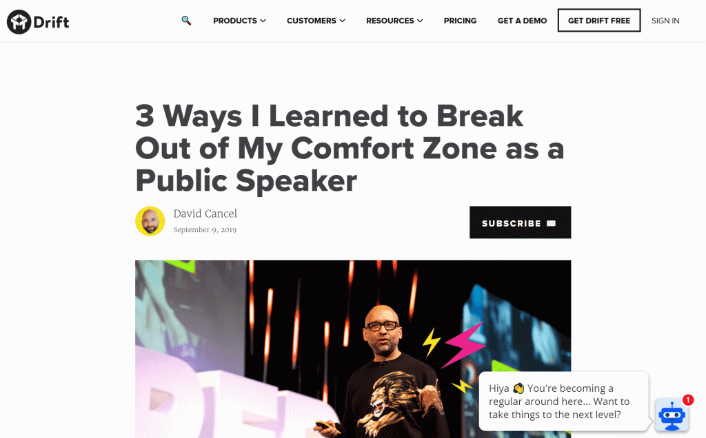
When it comes to Drift’s blog the word “simple” and minimalist design comes to mind. The internet is a distracting and noisy place. Drift has done an incredible job combating this by incorporating large margins, minimal color contrasts, and efficient calls-to-action. They incorporated both a top-of-the-funnel subscription callout and a hard sell to “get drift” with a sticky scroll function. A clever and effective way to help your blog convert visitors.
What we love about it
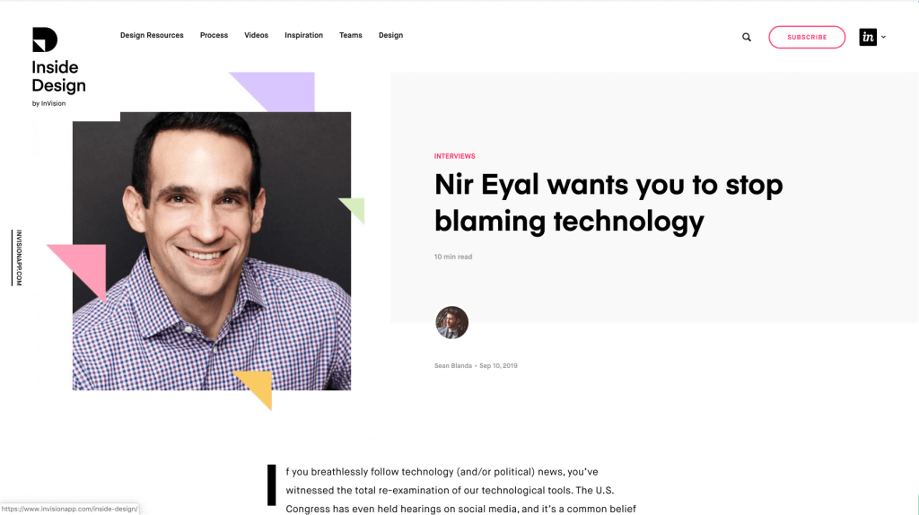
InVision keeps their title section engaging with an image, but simple enough to keep you reading on. To boot, there is also the read time incorporated so you know what type of reading commitment to expect. The large margins help users easily skim the content line-by-line without feeling overwhelmed. The click-to-tweet styling is bold enough to stand out from the text and entices users to share memorable quotes from the article.
Stepping back from the blog template for a moment. InVision did an incredible job with the layout of the parent blog page. Notice how they layout the featured and recent stories, but upon scroll, you’re introduced to video content before more recent stories? This is a well-designed use of real estate and prioritizing content to blog visitors.
What we love about it
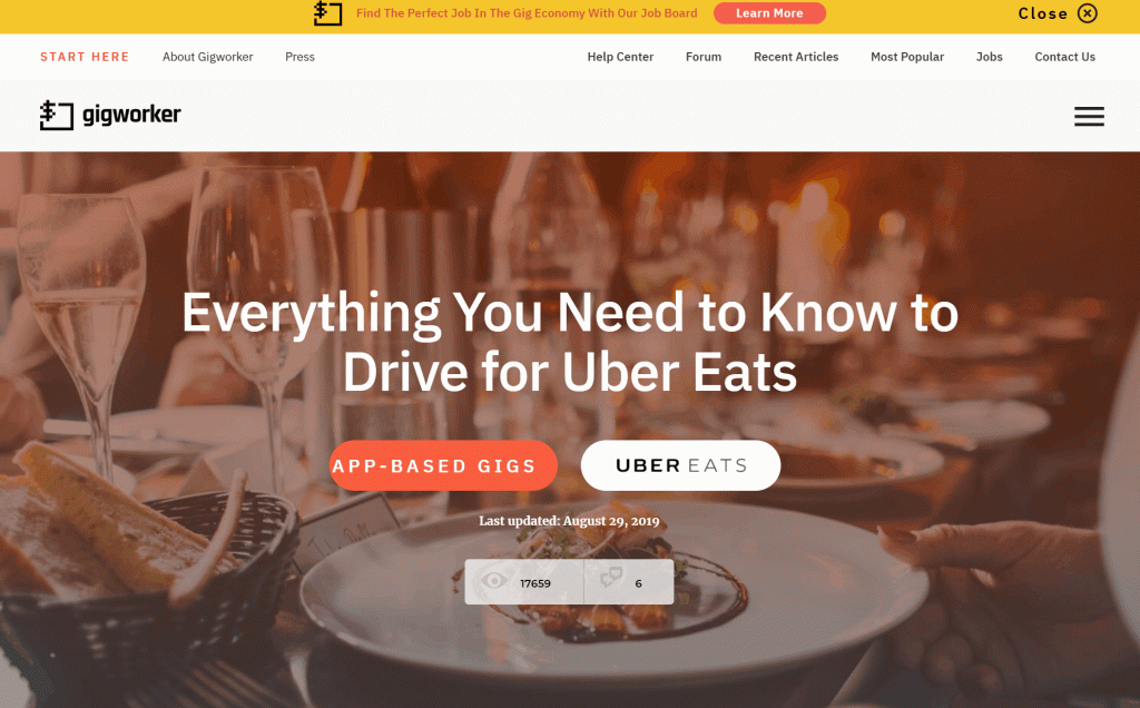
The majority of website traffic enters Gigworker through their blog. With that in mind, they’ve done an incredible job creating an engaging and user-friendly experience. The collapsible table of contents helps users to easily navigate to sections of interest without getting in the way of the article. We also love the styled CTAs and recommended articles to encourage users to explore other areas of the website.
What we love about it
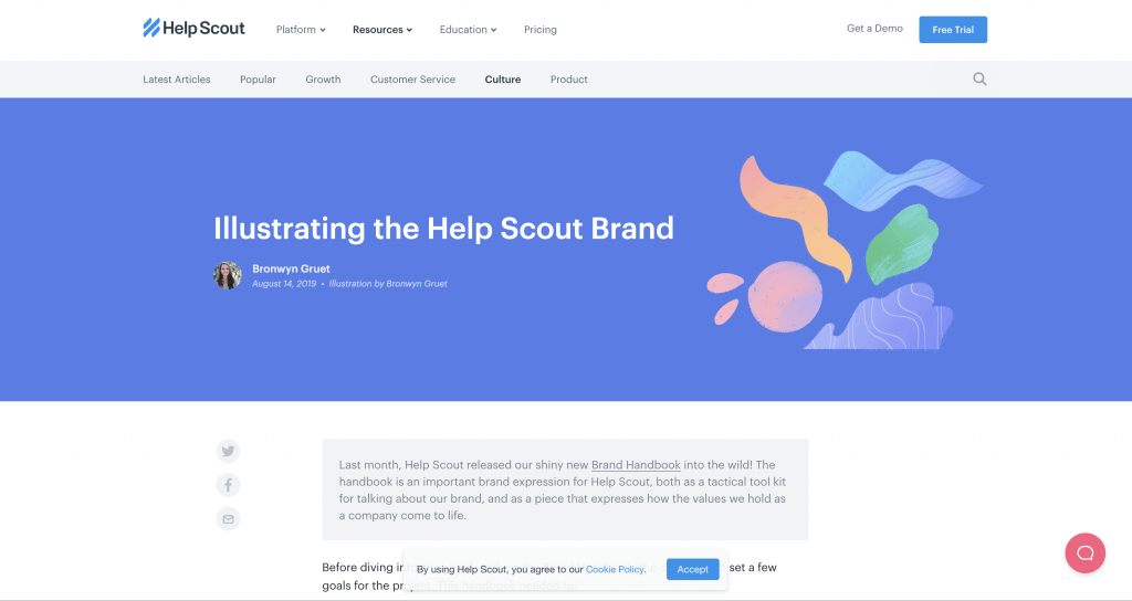
When it comes to supplementing the text with engaging graphics, Help Scout is at the top of the list. While creating these design elements on your own can be a costly effort, utilizing Fiverr for supplementing blog graphics can make all of the difference with your content.
Help Scout has a few other impressive design features worth mentioning. Their secondary menu to navigate blog content is well-designed and offers a simple way for users to navigate to other content categories. Even better is their sticky menu that serves as a breadcrumb trail for users. Huge props to the team over at Help Scout who spearheaded this blog design!
Annual Digest
What we love about it
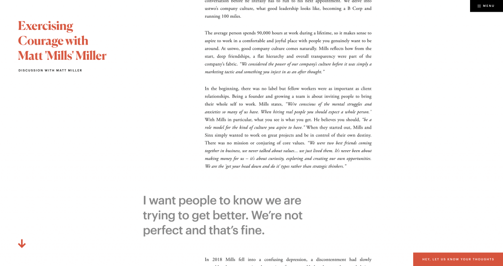
Not every blog’s design has to be a wide-margined, high-contrast design with large serif fonts and white background. Annual Digest did a great job making their blog content engaging with a more aesthetic, story-telling approach. They use full-width illustrations and interactive imagery. The full scroll sections help with the storytelling aspect, while the easily referenced section titles and the menu give users the context and ability to explore other areas of the site. While I’m confident their URL structures cause massive headaches from an SEO perspective, this design provides a fresh perspective on the possibilities to engage users with your next blog design.
What we love about it
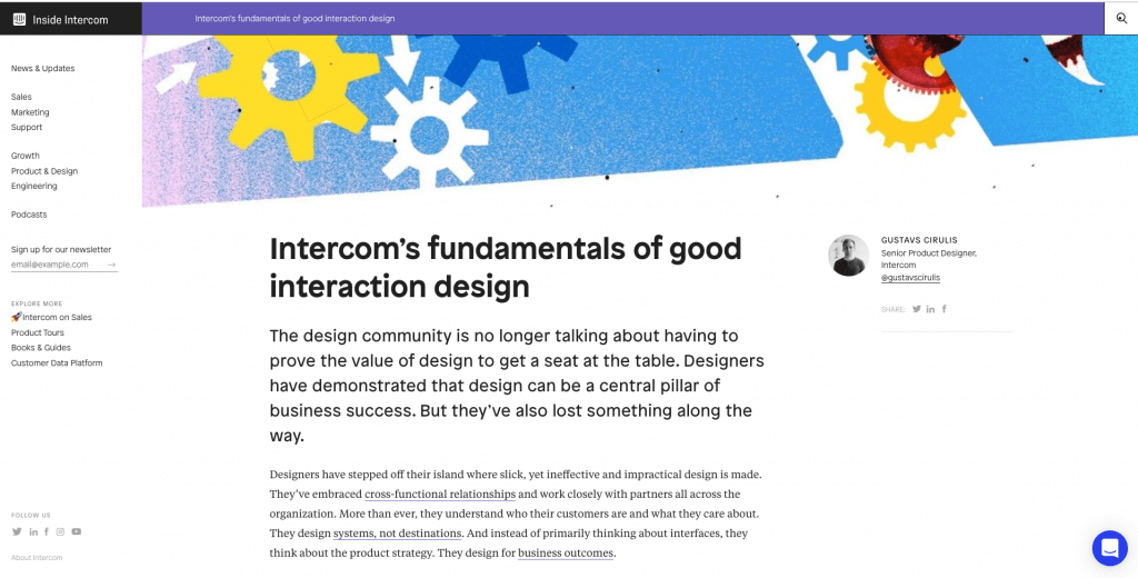
Whether it’s a blog post or podcast interview, Intercom understands the power of engaging content. What we love about their blog is the use of colorful title images. This stands out from the noise of the often abused stock imagery. They also incorporate animated GIFs and emojis into their content, which helps to hold the reader’s interest. To the left and right of the content, you’ll find options to explore the site further or download their ebook. They incorporate both of these CTAs in a way that hardly compromises the user experience.
What we love about it
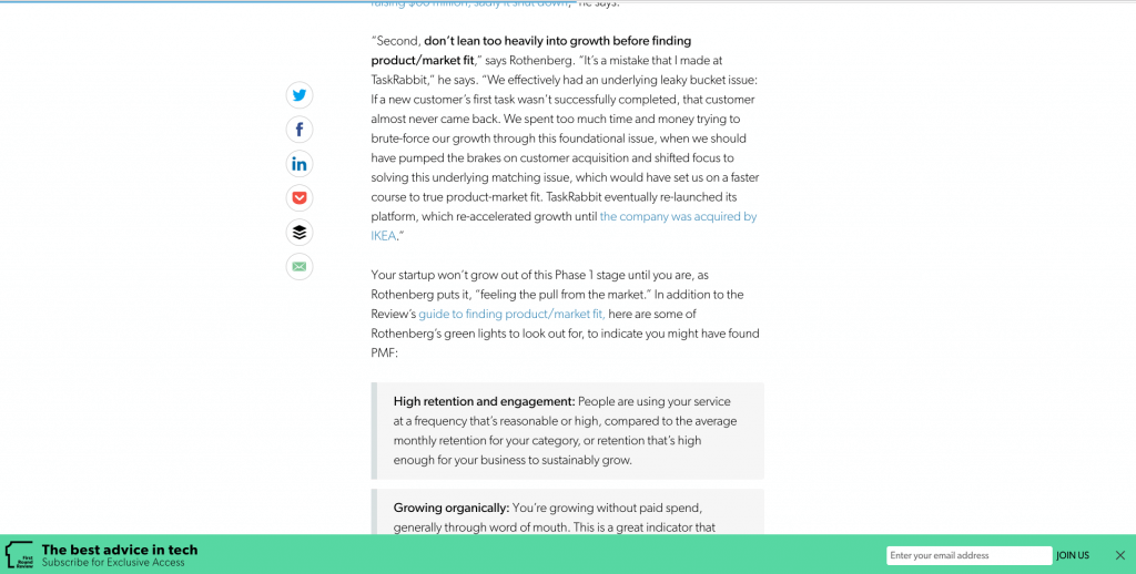
Going back to the mantra of “keeping it simple” First Round Review does just that. The large line heights and Gibson font helps to make the content skimmable and easy to consume. The sticky subscription callout has a great contrast to stand out against the blog content and encourage visitors to subscribe. However, the favorite feature of this blog template is the “Read This Next” content recommendations as you scroll down the article.
Wrapping it all up
We hope you’ve found a dose of inspiration within the insights and examples we’ve shared. Consider yourself armed and ready to design a badass lead-generating machine for your business. If you’re ready to design a new blog, but don’t know where to start, give us a shout! We’d love to help.
SCALE YOUR ORGANIC TRAFFIC
Subscribe to our monthly newsletter


