How we helped First Editing recover from a search penalty and increase goal completions by 118%.
Most agencies will cringe at the thought of redesigning a website that was hit by a search penalty. It’s messy business uncovering what factors led to a sudden drop in traffic and sales.
When First Editing came to us with plummeting traffic, in dire need of a website redesign, we knew we were the right partner to help.
Now, almost 3 months after launch, we’ve seen a 116% increase in free sample submissions, a 35% increase in organic traffic, and first-page rankings for high-value terms such as “professional editing services.”
From how we met, uncovering the penalty, and convincing them to change their mindset on SEO – this was one of our most challenging, but rewarding projects to date.
Plummeting Website Traffic & Declining Sales
For the past decade, First Editing has been providing professional editing services to academics, businesses, and authors alike. They generate most, if not all, of their revenue online through paid ads, email marketing, and organic rankings for high-value keywords.
In late 2015, they started to notice a drop in sales. Attributing the decline to seasonality, they continued along with business as usual. Unfortunately for them, sales didn’t improve.
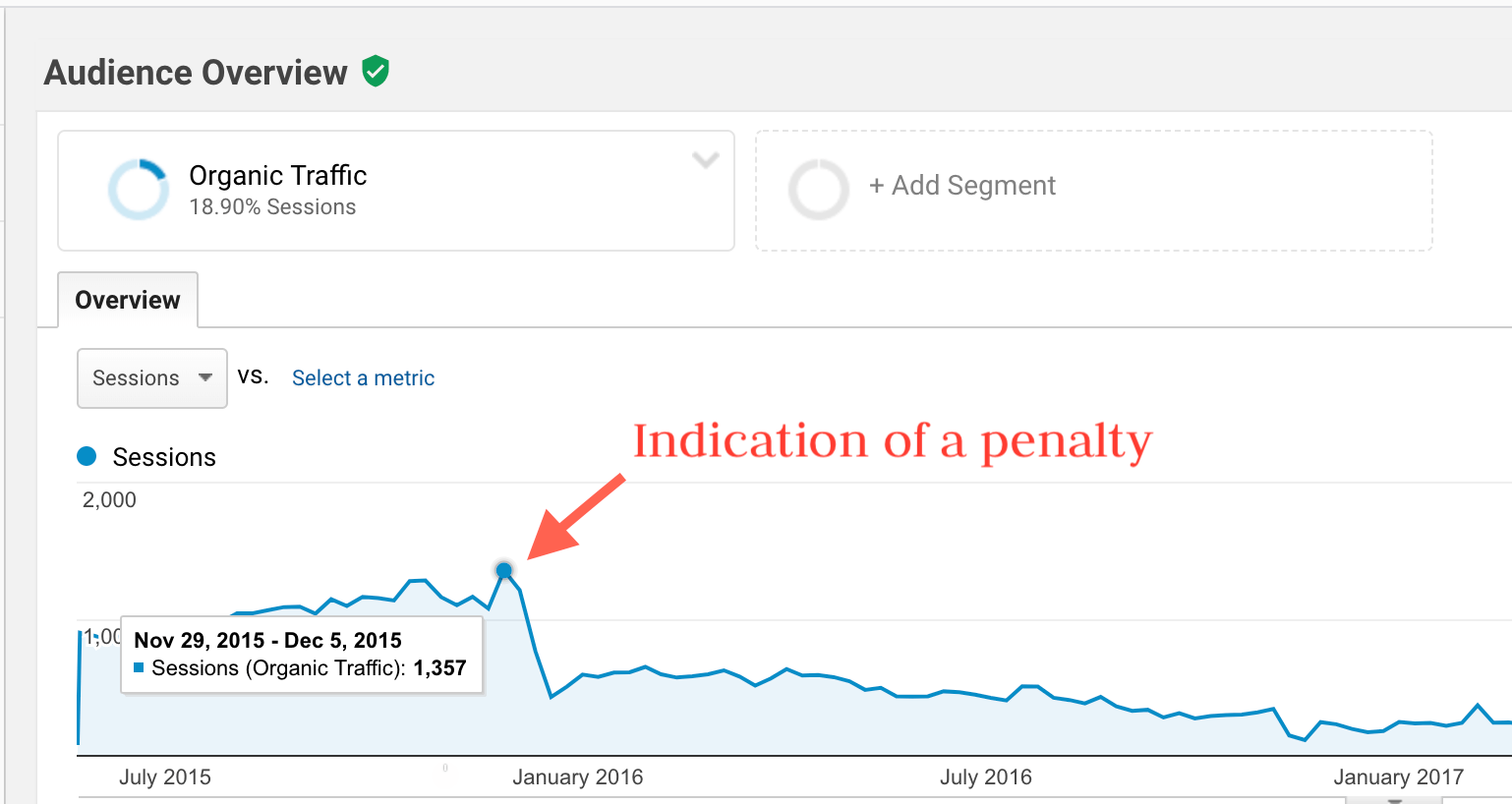
After looking into Google Analytics, they uncovered that their organic traffic and keyword rankings had plummeted around the same time sales started to decline.
Shortly after this finding, we were fortunate enough to meet their founder, JoEllen, at an SEO workshop that we presented over in Upsala. After a short conversation, we knew we would be a great fit to help them recover their lost traffic and rankings.
We spent the next month learning everything there is to know about their business. Adding the site to Hotjar, SEMRush, and a handful of other analytical tools we were able to uncover the answers to their declining traffic and ultimately, sales.
But this was the easy part.
Convincing them to change their approach to the website layout and content deemed much more challenging than anticipated.
Uncovering an SEO penalty
It’s never an easy feat to change the way a company thinks. For First Editing, they were convinced that SEO worked the same way that it did a decade ago.
As a digital marketing agency that lives and breathes SEO, we knew it was a completely different game then. However, it was up to us to educate them about the changing SEO landscape and the various algorithm changes implemented by Google.
So what changed since their site launched over a decade ago?
If we had to sum it up in one word, it would be “Rankbrain.”
In October 2015, Google debuted their artificial intelligence algorithm – dubbed Rankbrain. We’ll spare you the nerdy details, but from the screenshot below it’s easy to deduct that First Editing’s organic was jeopardized shortly after.
So why did this happen?
In short – thin content due to unnecessary exact keywords page across the site. If you’re not falling asleep yet, bear with me. You see, all of the pages listed below had exactly the same copy aside from substituting the specific keyword for each page.
- /novel-editing/
- /novel-editing-services/
- /professional-novel-editing-services/
- /professional-novel-editors/
While this variant keyword approach used to work, it is no longer the case. Google has gotten a lot smarter over the years, as it’s now able to identify topic themes, as opposed to needing keyword purpose pages that use exact match phrases. Oh, how times have changed…
So how did we recommend they resolve the issue?
- Consolidate content across the site into themes
- Re-write copy for the user…not for Google.
First Editing did exactly that. Over the next few months, they re-worked their website content relentlessly per our suggestions. Consolidating what was previously 4 pages per any given topic into 1 badass page full of helpful content for the user.
If you’re wondering whether or not this helped them drive more organic traffic – check out the “Outcome” section below.
Simplifying the User Experience
As you can imagine from a site that was designed a decade ago, it needed some love.
For starters, the first impression above the fold was overwhelming to users. They promoted, coupons, free samples, and individuals services all in the same view. This trend re-occurred throughout the site, overwhelming the user with dense copy, imagery, and long-form fields.
We knew this needed to change.
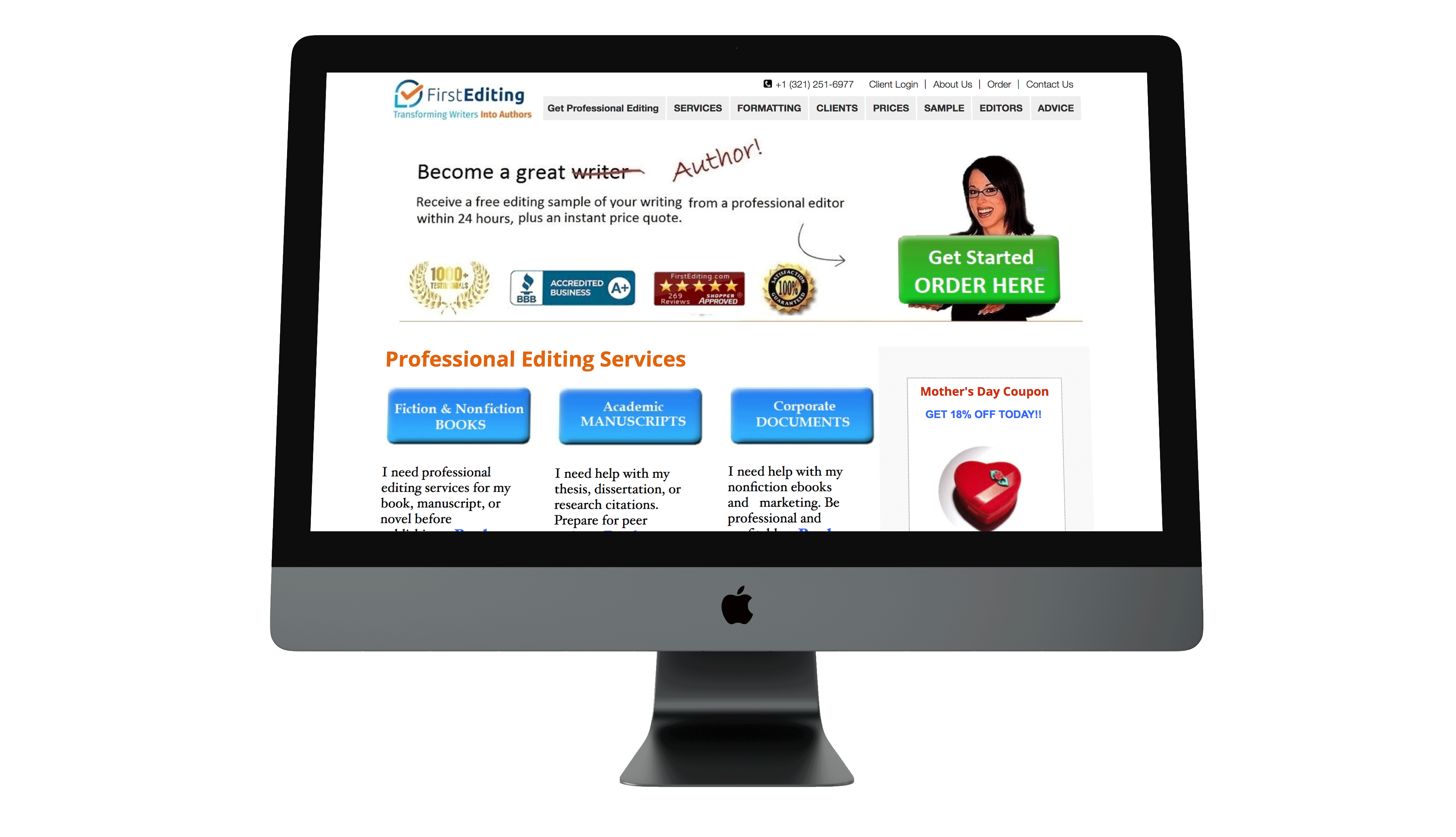
Screenshot from the previous FirstEditing.com website
The user experience needed to be simplified. This meant reducing the content, imagery, and goals of each page where possible.
Thinking back to our Discovery, we learned that the free sample offer was the largest lead generation initiative for First Editing. We used this as our primary offer for bottom-of-the-funnel prospects across the website. An instant price quote was used for top-of-the-funnel prospects, capturing their email upon submission.
With these new findings in mind, we went back to the drawing board armed and ready to start designing.
We started with the homepage. Thinking about the 3 types of personas they targeted and what their first impression was when visiting the site. The goal was to simplify the messaging and imagery above the fold, funneling the 3 persons to the services pages and ultimately to one of the two offers.
Outcome
So how did all of these efforts pan out for First Editing?
We’ll start with the keyword position changes. Below you can see a comparison of keywords rankings before and after the website redesign.
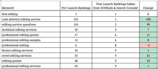
Comparison of keyword rankings before and after the website redesign and SEO Foundation
With the new site launch, First Editing starting to rank on the first page of Google for 9 more of their high-priority keywords. These keywords saw an average ranking improvement of 25 positions.
As expected with the jump in first page rankings, organic traffic saw an increase as well. Below is a screenshot that compares the organic traffic changes since we’ve launched the new site. In comparison to the previous period, we’ve seen a 35% increase in organic traffic and that metrics continue to climb.

Organic traffic has increased 35% since launch
Free sample saw the largest change from all of our efforts, with a 116% increase in submissions since the new site launch.
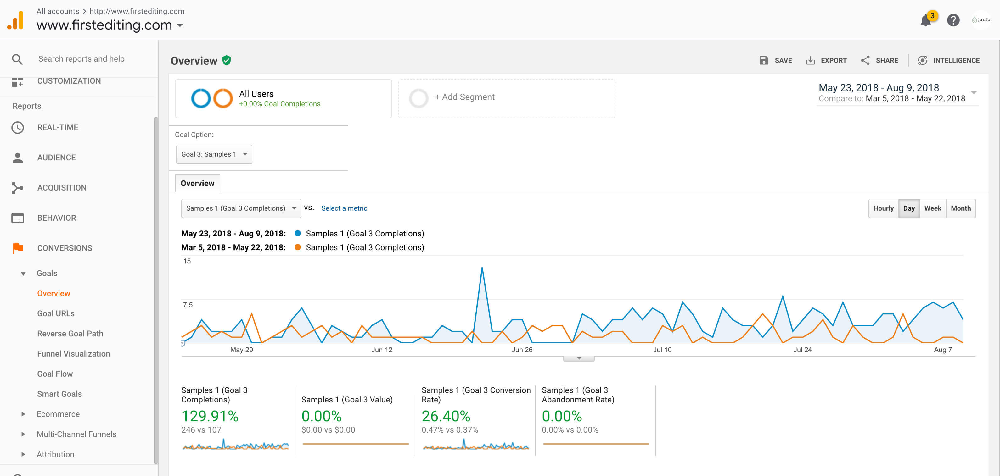
Goal completions for free sample submissions have increased almost 130% since launch
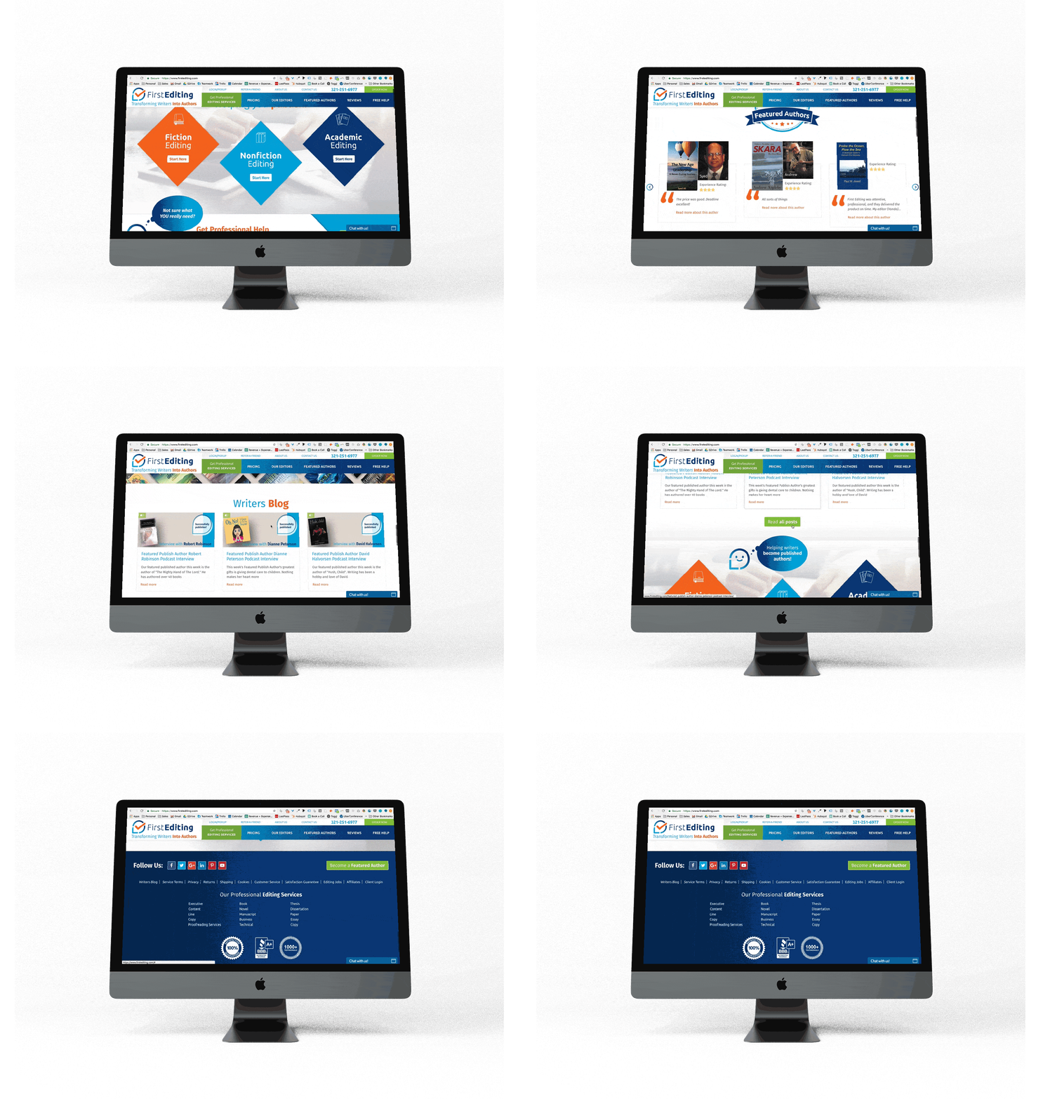
Interested in seeing how the new site looks in comparison? You can view it here or check out the GIF below.
Mockup of the new FirstEditing.com website
We aren’t going to say it was easy to achieve all of these results. It took a lot of trust-building, education, and grunt work. In the end, it was all worth it.
If you’re interested in seeing what we can do for your website, give us a shout. We’ve love to learn more about how we can help your business.
(Read more about our awesome web development work and the results we generate in this article: How a Site Redesign Can Increase Goal Completions by 400%+)
SCALE YOUR ORGANIC TRAFFIC
Subscribe to our monthly newsletter


