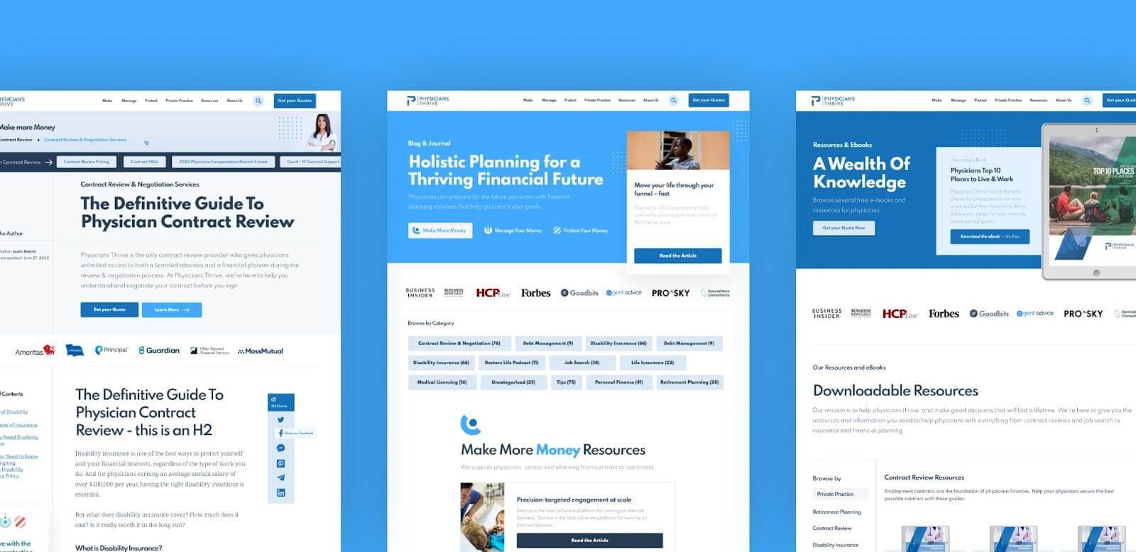
Physicians Thrive came to us looking for more traffic and more leads.
We were able to help them accomplish that.
By August 2021, PhysiciansThrive.com saw 492.64% more traffic than it did in August 2020.
Goal completions were up by 222.73!
How did we do it?
By redesigning the website to optimize the lead funnel and revamping the content strategy.
Check out how the redesign made its standout impact on those amazing results.
We Began With a Website Audit
One way to increase goal completion is to make sure website visitors can move around the site easily.
We ran an audit of the site in 2020 to see how seamless that journey was for busy physicians.
Here’s what we uncovered in our initial website audit:
1. Call-to-action buttons weren’t placed strategically around the page
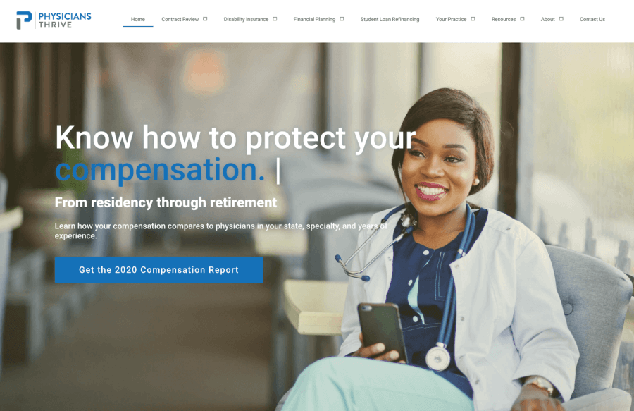
The CTA on the top half of the homepage was the “Download Our 2020 Compensation Report” button, which only spoke to a tiny segment of Physicians Thrive’s audience. The “Work With Us” CTA was so far at the bottom of the page that it was unlikely most visitors were seeing it.
2. The site was difficult to navigate
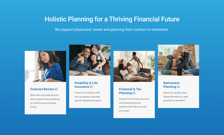
With too many options available on the homepage, and no search feature, this site made it hard for visitors to find answers to all of their questions.
Our Action Steps and Implementation
Our solutions for the problems laid out above (as well as the other site issues we identified) can be broken into three categories:
1. Conversion Rate Optimization
This category describes the steps we took specifically to encourage CTA clicks from visitors.
Here are some of the actions we implemented to optimize for conversions:
- Moved most important CTAs toward the top of the page
- Incorporated animations and other visual cues to draw the eye toward CTA buttons
- Eliminated some navigation items to make CTAs more visible
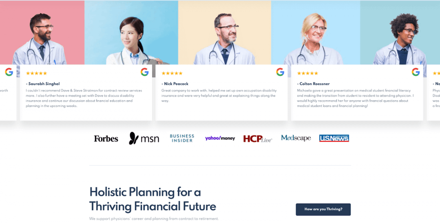
- Added reviews and success stories to the homepage as social proof
Most importantly, we added a “Get Started” button to the top-right corner of the page, which makes it easy for users to sign up for PT’s mailing list (their primary lead-generation tool).
2. User Experience
This category includes all of the actions we took to make the user’s browsing experience smoother and more comfortable.
This meant:
- Adding a search bar to help browsers find the answers to their particular question
- Making parent page menus more obvious in the navigation
- Increasing the size of clickable areas to make clicking easier
- Compacting code and compressing images to improve site speed
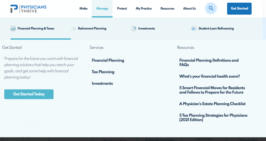
Another very important thing we did was to make the header bar a more central component of the user experience.
We took the services they listed there — Contract Review, Disability Insurance, Financial Planning, etc. — and organized them into categories based on actions.
Now, instead of this:

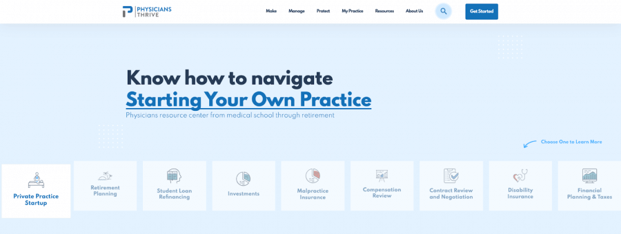
The header looks like this:

…with dropdown menus linking to all of the services:
3. Responsive Design
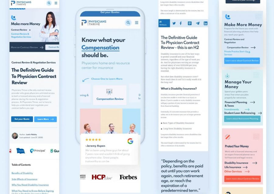
The actions in this category are about making the site friendly for mobile users.
As of the first quarter of 2021, mobile traffic accounts for almost 55% of all web traffic, so it’s important to make sure your site looks and functions well on phones and tablets.
Here are some of the steps we took in rebuilding the mobile site:
- Improved the mobile menu to make it easier for browsers to find what they need
- Stacked Physicians Thrive’s offerings to make their services clearer to new audiences
- Added a sticky menu that stays at the top of the screen so browsers can access it at any point in their session without having to scroll back up
Our Results
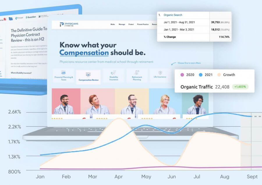
Here’s what Physicians Thrive’s search numbers and goal completions look like since we started working with them:
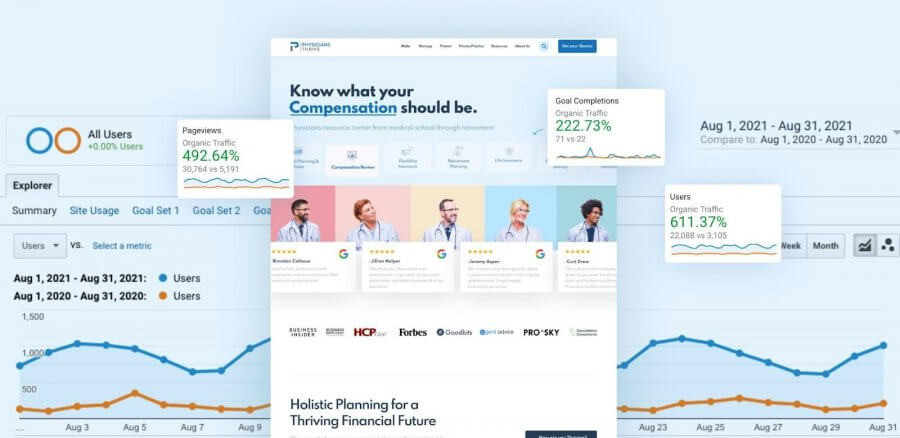
The site redesign has contributed to increasing Physicians Thrive’s goal completions by 222.73%!
Here’s what the completed site looks like:

Conclusion
For consulting businesses like Physicians Thrive, a website is crucial for lead generation. But in order to work effectively, sites must be dynamic, responsive, and strategically designed.
To recap, here’s how our redesign improved the performance of PhysiciansThrive.com:
- Increased goal completions by 222.73%
- Boosted pageviews by 492.64%
- Grew user count by 611.37%
We want to help you grow your business, too. Reach out to us here and we’ll be in touch within one business day!
Learn about our services:
Content Marketing Services | White Label Web Development | Web Design & Development
SCALE YOUR ORGANIC TRAFFIC
Subscribe to our monthly newsletter


