Every business wants its website to attract leads.
But not just any leads — qualified leads that have a high chance of converting.
How do you know if they’re qualified?
Because they don’t just visit your website, they take action. They sign up for your mailing list, fill out your lead generation form, and contact you to learn more about your services.
That’s why we know our web development and content marketing services are the best in the industry; we drive high-interest traffic to our clients’ websites, and we help our clients convert those visitors into leads, subscribers, and customers.
And they’re very happy with the results.
Here is a client story we’re particularly proud of:
Now
When they came to us in early 2021, they weren’t thrilled with their website’s performance, which was seeing fewer than 3,400 visitor sessions each month and generating far fewer leads than they wanted.
But we turned that around.
During the four-month period between May 1, 2021, and August 31, 2021, we increased their traffic by 132.65% from the previous four-month period.
We also helped them to increase their goal completions by 400.68% in the same period of time.
How did we do it?
By redesigning their website and revamping their content strategy.
Site Redesign
Here are a few screenshots that show what Now’s homepage looked like when we first started with them:
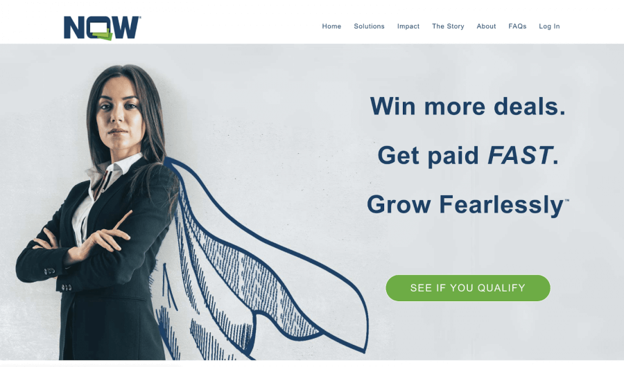
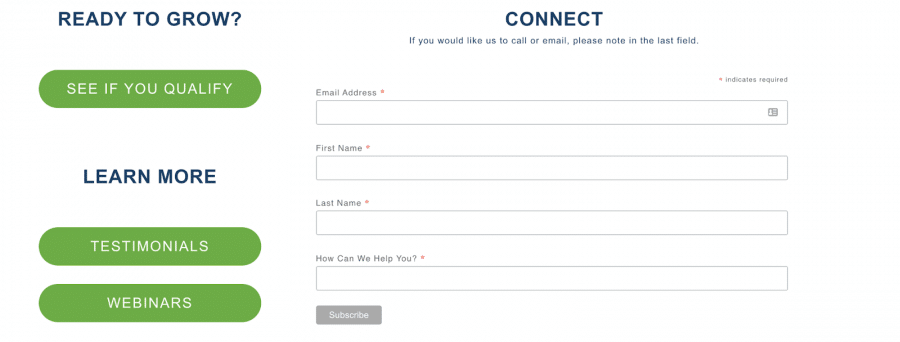
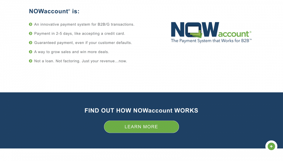
A few things about this were immediately clear:
1. It didn’t present the product in a clear way.
A customer unfamiliar with accounting and banking might not understand what Now was offering or why this service was valuable.
2. It didn’t speak to the target audience.
Now was founded to help women-and minority-owned small businesses, but that message was lacking in their site’s content and imagery.
3. There was no sense of warmth/authenticity.
They offer a unique and generous service, but nothing in the site’s images, text, or layout reflected that.
4. It looked outdated.
The site had more of a 2011 feel than a 2021 feel. Now needed something more contemporary.
Our Goals
We set out to change all of that, giving the Now website a complete redesign.
We wanted the new site to:
- Be clean, bright, and outwardly supportive of their target audience
- Have a warmer, more casual feel (as opposed to a cold, corporate one)
- Speak to diverse audiences
- Address the audience’s problems in a more direct way
Ultimately, we wanted to create a site that would encourage visitors to click and submit one of the lead generation forms present on the site.
Our Action Steps and Implementation
Here are some things we did to achieve the goals laid out above:
Incorporating New Brand Colors and an Engaging User Experience
Now had already enlisted Ramble, a branding agency, to help revamp their image. Ramble scaled back from the stark colors (like navy) that were dominating the site, to a more casual tone with mint green and soft orange.
We incorporated those colors and added movement.
While photographs appear black and white upon the initial page load, an animation brings them into color when hovered over.
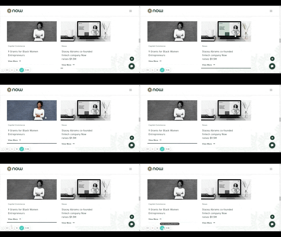
(click for animation)
Both of these changes allow the site to maintain a soft, friendly atmosphere while adding a dynamic, interactive feel to it.
We Highlighted CTAs and Other Areas of Interest
We added a bright but slightly muted orange to the theme in spots that we wanted to highlight or encourage action (such as in the “See if you Qualify” buttons, which we really wanted to get people clicking).
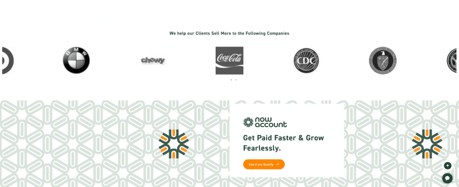
We also incorporated animations in the area around some CTAs to get the eye looking in that direction.
We Set a New Tone With Photographs and Images
Serving diverse communities and empowering small businesses is a priority goal for Now.
We focused a lot on these aspects when choosing photographs and images for the redesign.
For instance, not all business owners wear suits to work. One of the prominent images on the site was of a woman in an authoritative stance, but she didn’t give off an encouraging vibe. We thought that a photo of a woman wearing a T-shirt would be more relatable than a suited businesswoman.

The poses are different, too, which was very intentional. Whereas the previous woman had her arms crossed, this woman appears to be either flexing or cheering for herself.
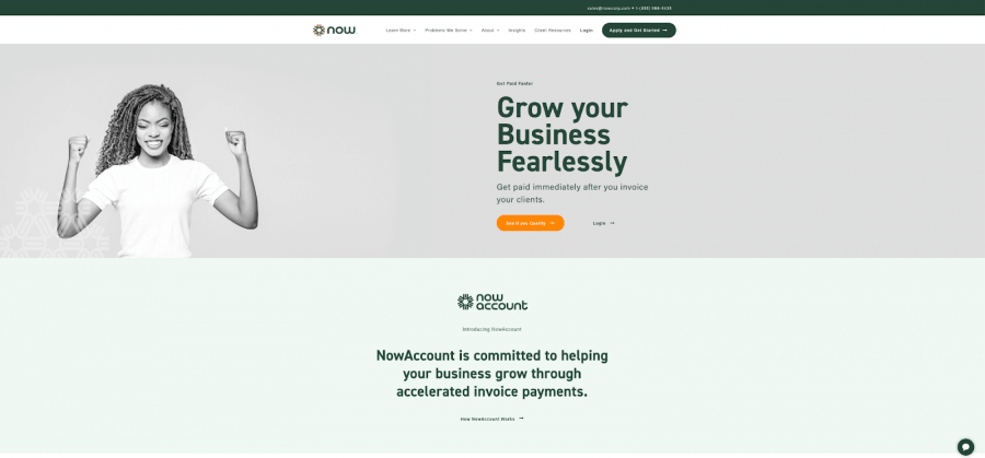
Both images communicate a sense of empowerment, but we wanted a model with open arms to welcome visitors to the site.
We Made the Homepage More Informative
Most of the information that was previously on the site’s “About” page got moved to the homepage.
The text has been updated so that visitors from every knowledge level — with or without business or finance degrees — can understand what Now sells and why their services are valuable.
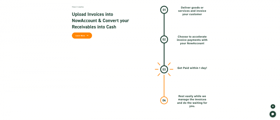
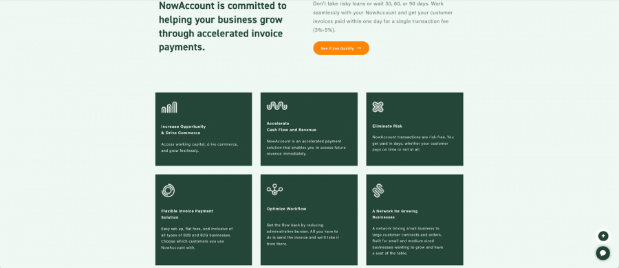
In our version of the site, the homepage tells a story, walking visitors through their process to show them how Now works and how it’s helped other clients.
Here are a few pics of our redesign:
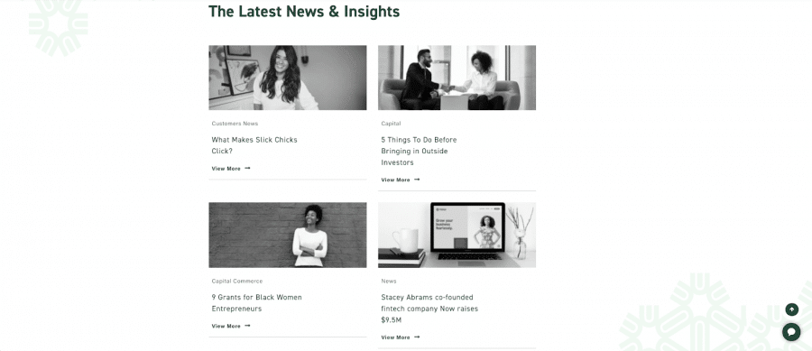
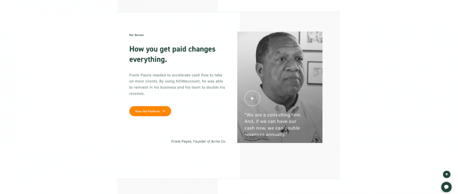
Content Strategy Overhaul
While the web dev team was redesigning the site, our content team planned and put into action a new blogging strategy to start driving traffic to the site.
This meant:
Pinpointing Topics That Were of Importance to the Target Audience
The purpose of a blog is to draw your audience to your website using content that appeals to their interests.
We brainstormed topics that Now’s ideal client (business owners seeking cash flow) might be interested in.
Identifying Keyword Opportunities Related to Those Topics
To get our content ranking in Google searches, we had to identify the terms that people are typing into the search bar when looking for content about the topic at hand.
We conduct keyword research to identify terms that meet two criteria:
1. High search volume
Or high enough to justify hours of work. Remember, the goal in writing these articles is to attract leads, so we want to target terms that people are actually searching for.
2. Low competition
Easier to rank for while we build site authority. Ranking for a lot of low-difficulty keywords creates a snowball effect that enables the site to start ranking for more terms with more competition over time.
Related: Why Your Keyword Research Process Is Failing You
Writing Comprehensive Articles
Once we have a keyword strategy outlined, our writing team gets to work. We focus on creating the best resources on the internet about our chosen topics.
It’s important that our resource answers all of the questions our audience might have about that topic — including questions they didn’t even know they had.
Optimize Our Writing for Search Engines
SEO is about more than just writing good content; you have to make sure that search engines understand what your content is about. That’s the key to making your blogs visible on search engines!
Here are some of the things we do to push our content up in the rankings:
- Edit title tags and meta descriptions to tell search engines the primary topic of each page
- Add relevant keywords to section headers to make clear what each section is about (and to increase our chances of ranking for a Featured Snippet)
- Linking to the page from our other high-performing articles to let Google know that this page is equally as valuable
- Incorporate readability optimizations to keep readers engaged and create a better reading experience
One thing that sets our writing process apart from other agencies is that we optimize our content using TF-IDF, or Term Frequency-Inverse Document Frequency.
Essentially, we use software that creates a list of subjects discussed in all of the top-ranking articles for our target keyword. Discussing those subjects in our article helps us to create a more complete article and to make it easier for Google to understand what the article is about.
Promote the New Blogs!
Because we conducted thorough research and optimized our articles, we’re confident that our articles will rank in the SERPs in the future. And once more people start finding it, they’ll share it, link back to it, and drive it even further up in the rankings.
In the meantime, we jumpstart that process by sharing the article on social media and with bloggers who we think would be interested in it.
Our Results
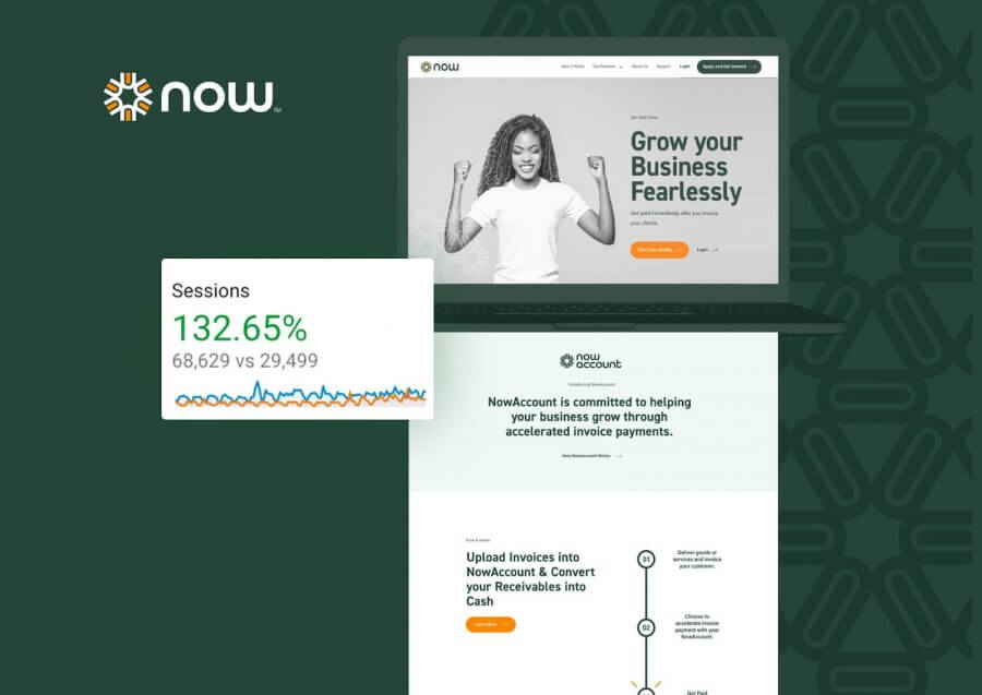
Here’s what we achieved during the first four months working with Now:
| 12/29/20 – 4/30/21 (Before) | 5/1/21 – 8/31/21 (After) | Total Growth | |
| Sessions | 29,499 | 68,629 | 132.65% |
| Goal completions (“See If You Qualify” form submissions) | 676 | 2,238 | 231.07% |
| Goal completions (Registration form submissions) | 11 | 205 | 1,763.64% |
| Unbranded keyword rankings | 18 | 355 | 1,872.22% |
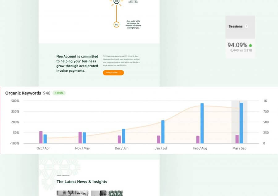
We increased other metrics, too — chatbox email captures by 246.91%; email confirmations by 1,371.36%; app leads by 2,368.29%.
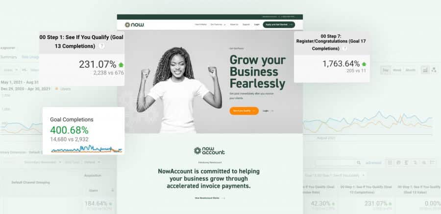
All in all, our site redesign and content marketing efforts helped us to increase goal completions by 400.68%!
Interested in seeing what you can do for your website? Let’s chat! Get an estimate on our web development services or content marketing services and let us know what you’re looking for!
We want to help you grow your business, too. Reach out to us here and we’ll be in touch within a business day!
Learn more about our services:
Content Marketing Services | White Label Web Development | Web Design & Development
SCALE YOUR ORGANIC TRAFFIC
Subscribe to our monthly newsletter


